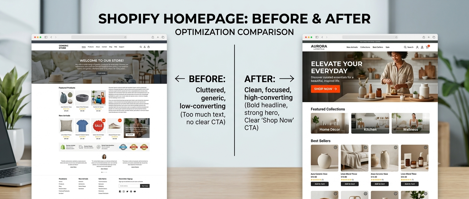
Your homepage gets one shot. A visitor lands, scans for three seconds, and decides: stay or leave.
Most Shopify store owners pour money into ads and traffic, then send that hard-earned traffic to a homepage that doesn't convert. The layout is cluttered, the message is unclear, or the trust signals are missing. Sales stall. Ad spend bleeds.
Here's the good news: a high-converting Shopify homepage isn't magic — it's structure. Every top-performing store follows the same anatomy. In this guide, we'll break that structure down section by section so you can audit your own store and know exactly what to fix.
Why Your Shopify Homepage Is Your Most Important Page
Your homepage isn't just a pretty front door. For most stores, it's where:
- New visitors decide if you're worth their trust
- Returning customers look for what's new
- Ad traffic lands when no specific product is targeted
A weak homepage leaks revenue at every stage of the funnel. A strong one guides visitors naturally toward their first purchase.
The difference isn't a bigger budget; it's knowing what belongs where, and why.
Section 1: The Hero — Your First and Most Critical Impression
The hero section is the large banner area that visitors see the moment they land on your site, before scrolling. It does one job: communicate your value and push visitors forward.
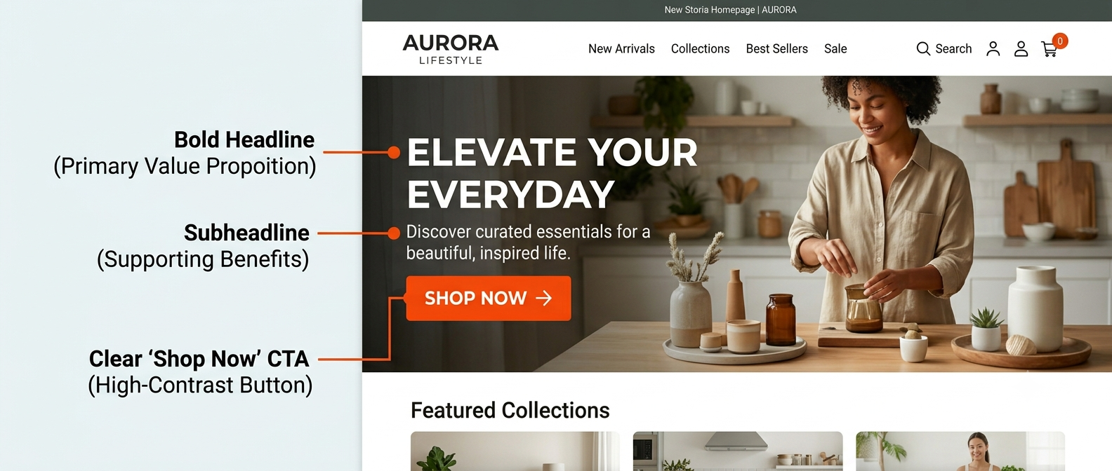
A converting hero needs four things:
- A clear headline — what you sell and who it's for, in plain English
- A supporting subheading — the benefit or the promise (not your company history)
- One primary CTA button — "Shop Now," "Find Your Fit," "Get Started" — specific beats generic
- A strong visual — your product in use, not floating on a white background
What kills most hero sections:
Too many CTAs ("Shop," "Learn More," "Watch Video," "Browse Lookbook"). Every extra option reduces the chance that visitors will click any of them. Pick one.
Example: A skincare brand changed their hero from "Welcome to our store" + three buttons, to "Skincare for sensitive skin — gentle ingredients, real results" + a single "Shop the Range" button. Add-to-cart rate on first visit increased by 34%.
Section 2: Trust Bar — Build Credibility in One Strip
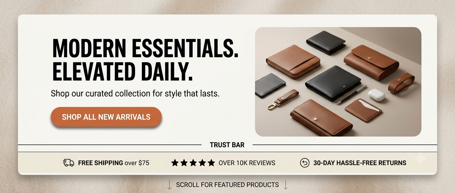
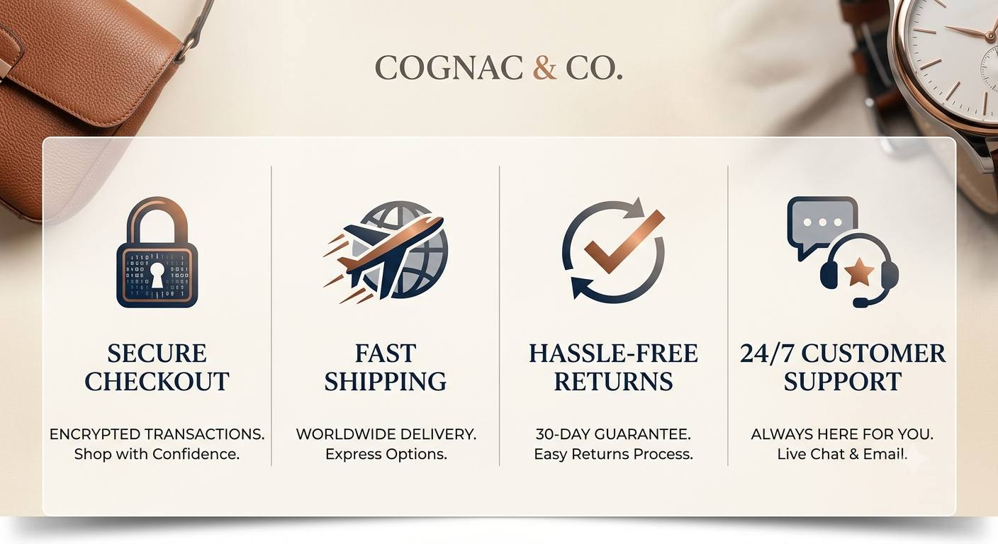
Immediately below the hero, a trust bar does something powerful: it answers the customer's unspoken question — "Why should I trust this brand?"
A trust bar typically sits in a thin row and includes 3–5 short signals:
- ⭐ "4.9/5 from 2,000+ reviews"
- 🚚 "Free shipping on orders over £40"
- 🔁 "30-day hassle-free returns"
- 🔒 "Secure checkout"
- 🏆 "As seen in [publication]."
Keep it visual (icons + short text). Keep it honest. This section takes 30 minutes to add and can meaningfully lift your conversion rate — because most first-time visitors are still deciding whether your store is legit.
Section 3: Featured Products or Collections — Guide the Next Step
Once trust is established, give visitors somewhere obvious to go.
Option A: Featured Collections — Best for stores with multiple product categories. Show 3–4 collection images with clean titles. Let visitors self-select their path.
Option B: Best Sellers — Best for focused or single-category stores. Show your 3–4 top-performing products with prices and reviews visible.
The rule: Don't show everything. Showing 12 products on your homepage feels overwhelming and reduces clicks. Curate ruthlessly.
Use a simple product grid with star ratings visible. Ratings shown in category listings (not just product pages) have been shown to lift click-through rates consistently across eCommerce research.
Section 4: Brand Story or Value Proposition — The "Why Us" Block
This is the section most stores skip — and it's one of the reasons they lose sales to competitors.
A short brand story block (2–3 sentences + an image or icon set) answers:
- What makes you different?
- Who is this for?
- Why should I buy here instead of Amazon?
It doesn't need to be your company's origin story. It needs to speak to your customer's values.
Example copy: "We make outdoor clothing for people who actually go outdoors — not just think about it. No fast fashion, no compromises. Just gear that works."
One paragraph. Confident. Specific. Relevant.
Section 5: Social Proof — Reviews, UGC, and Press
After the value prop, reinforce it with proof. This section exists because people don't believe brands — they believe other people.
Include at least one of:
- A review carousel — pull your best 5-star reviews (bonus if they mention specific results)
- User-generated content (UGC) — customer photos using your product
- Press mentions — logos of publications that have featured you
- Stats — "10,000+ happy customers," "Rated #1 in [category]"
If you're using Shopify apps for reviews, Loox and Judge.me both offer homepage widgets. For a cleaner, custom solution, Heaven Tech builds these directly into your theme, no app bloat required.
Section 6: Email Signup — Capture Visitors Who Aren't Ready to Buy Yet
Most first-time visitors won't buy on their first visit. That's just reality. An email signup section lets you capture them before they leave.
Make the offer specific:
- ❌ "Subscribe to our newsletter"
- ✅ "Get 10% off your first order + early access to new drops"
Place this above the footer, not buried in it. A pop-up is fine too — but time it right (show after 30 seconds or on exit intent, not the moment someone lands).
Shopify Homepage: App Widget vs. Custom Code
When building homepage sections, you'll often face this choice:
| App Widget | Custom Code | |
|---|---|---|
| Setup time | Minutes | Hours/days |
| Cost | Monthly subscription | One-time build |
| Design flexibility | Limited | Full control |
| Site speed impact | High (adds scripts) | Low (clean code) |
| Long-term value | Ongoing cost | Yours forever |
For early-stage stores, apps are fine. For stores doing consistent revenue and wanting to stand out, custom-built sections perform better and load faster. (We cover the speed side in detail in our guide on [Shopify store speed optimization] faster pages convert significantly better.)
A Quick Homepage Audit Checklist
Run through this before you change anything:
- Is your headline specific to what you sell and who it's for?
- Is there exactly ONE hero CTA?
- Does your trust bar appear above the fold on mobile?
- Are reviews or ratings visible without clicking into a product?
- Is there a brand statement that says something your competitor couldn't copy?
- Does your email signup offer a real reason to sign up?
- Does your homepage load in under 3 seconds on mobile?
If you answered "no" to three or more — your homepage is costing you sales right now.
Adding a Trust Bar: Simple Shopify Liquid Snippet
Here's a clean, minimal trust bar snippet you can add to your Shopify theme. Paste this into a new section file (/sections/trust-bar.liquid):
{% comment %} Trust Bar Section — Heaven Tech Solutions {% endcomment %}
<div class="trust-bar">
  <ul class="trust-bar__list">
    {% for block in section.blocks %}
      <li class="trust-bar__item">
        {% if block.settings.icon != blank %}
          <span class="trust-bar__icon">{{ block.settings.icon }}</span>
        {% endif %}
        <span class="trust-bar__text">{{ block.settings.text }}</span>
      </li>
    {% endfor %}
  </ul>
</div>

<style>
  .trust-bar {
    background: #f5f5f5;
    padding: 12px 20px;
    text-align: center;
  }
  .trust-bar__list {
    list-style: none;
    display: flex;
    justify-content: center;
    flex-wrap: wrap;
    gap: 24px;
    margin: 0;
    padding: 0;
  }
  .trust-bar__item {
    display: flex;
    align-items: center;
    gap: 6px;
    font-size: 14px;
    font-weight: 500;
  }
</style>

{% schema %}
{
  "name": "Trust Bar",
  "blocks": [
    {
      "type": "trust_item",
      "name": "Trust Item",
      "settings": [
        { "type": "text", "id": "icon", "label": "Emoji Icon", "default": "⭐" },
        { "type": "text", "id": "text", "label": "Text", "default": "4.9/5 from 2,000+ reviews" }
      ]
    }
  ],
  "presets": [{ "name": "Trust Bar" }]
}
{% endschema %}
Add the section to your homepage template via the Shopify theme editor, then add your trust items through the customizer, no coding required after setup.
Final Thoughts: Your Homepage Is Always a Work in Progress
A high-converting Shopify homepage isn't something you set up once and forget. The best stores treat it as a living thing, testing headlines, switching up hero images, and updating social proof as reviews come in.
Start with the fundamentals: a specific hero, a trust bar, curated products, a real brand message, and a reason for visitors to hand over their email. Get those right first. Then optimize from there.
If you'd like a second pair of expert eyes on your homepage and your store as a whole, Heaven Tech Solutions offers a free Shopify store audit. We'll look at your layout, your conversion flow, your speed, and your brand positioning, and tell you exactly what we'd fix and why.
No pitch. No obligation. Just a clear, honest review from a team that builds Shopify stores for a living.
Comments (0)
Leave a comment